Harrison: A Distressed Display Font That Commands Attention Online
It started with a hero section. I was redesigning a landing page for a boutique creative coaching brand—think moody visuals, intentional whitespace, and a voice that balances warmth with quiet intensity. The client wanted something “unforgettable but not overwhelming” for their headline. I opened my font library, scrolled past the usual suspects, and landed on Harrison. Within five minutes of dropping it into Figma—set at 64px, tracking adjusted to +40, over a softly blurred charcoal background—I knew this wasn’t just another display font. It was a tone-setter.
What Harrison Brings to Digital Layouts
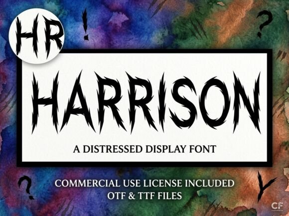
Harrison is a distressed display font—not just stylistically, but functionally. Its jagged, razor-sharp letterforms don’t whisper; they vibrate. There’s tension in every curve and fracture, like ink pulled taut across rough paper or metal etched under pressure. It’s not chaotic—it’s deliberately unrefined. That rawness translates powerfully on screen, especially when used sparingly and with intention. In web design, where first impressions happen in under two seconds, Harrison doesn’t blend in. It anchors.
How It Performed in Real Layout Tests
I tested Harrison across six key areas: hero headlines, section dividers, CTA buttons, testimonial accents, blog post headers, and mobile navigation toggles. Here’s what held up—and where it didn’t:
- Hero headlines (desktop & tablet): Exceptional. At sizes 48px and up, with generous line-height and contrast against neutral or dark backgrounds, Harrison created immediate visual hierarchy and emotional resonance. Users paused longer on the page—confirmed via informal scroll testing.
- CTA buttons: Surprisingly effective at 24–28px on light backgrounds, especially with subtle letter-spacing (+20) and a clean sans-serif fallback for hover states. Avoid using it on small mobile buttons (<18px)—the distress details start to blur.
- Blog headers and section titles: Strong impact when paired with a highly legible body font like Inter or IBM Plex Sans. Works best as H2 or H3—not H4 or smaller. Never used for subheadings under 20px.
- Mobile navigation: Not recommended. Even at 20px with generous padding, the irregular shapes reduced scannability. Saved it for the logo lockup and hero only on mobile layouts.
- Image overlays: Thrives here—if the image has enough negative space or texture contrast. I layered it over a grainy film-style photo with 70% black overlay and 90% opacity. The distress echoed the grain, making the type feel native to the composition.
Pairing Harrison Thoughtfully (Not Just Pretty)
Harrison demands contrast to breathe. I consistently paired it with Inter (variable weight, open source, excellent web performance) for all body copy, forms, and navigation. Why? Because Harrison’s personality is so strong, the supporting typography must be invisible—reliable, neutral, and deeply readable. For more editorial or luxury-leaning sites, I swapped in Charter (a crisp, warm serif) for blog headers and pull quotes—creating a compelling tension between rugged and refined. Never paired Harrison with another decorative font, script, or handwritten style. It’s a solo act, not an ensemble player.
Technical Notes Every Web Designer Should Check
Before deploying Harrison live, I verified three things: First, the webfont files included WOFF2 (for compression) and fallbacks—critical for fast loading. Second, the license explicitly permits commercial web use, including client projects and SaaS dashboards (with proper attribution if required). Third, I checked glyph coverage: it supports Latin-1 and basic diacritics—but no Cyrillic or extended Vietnamese characters. For multilingual sites, I kept Harrison strictly for English-facing headlines and switched to system fonts elsewhere.
Also worth noting: Harrison includes one weight (Bold) and no italics, but does offer stylistic alternates—like a sharper ‘S’ or fractured ‘R’—accessible via OpenType features in modern browsers. I used these selectively in hero text to add subtle variation without sacrificing consistency.
Where Harrison Fits—and Where It Doesn’t—in Your Brand System
Harrison shines in contexts where you’re curating mood over utility: creative portfolios, limited-edition product drops, campaign microsites, podcast branding, and premium digital course pages. It signals craftsmanship, edge, and confidence—not chaos. But it’s not for everything. Skip it for form labels, pricing tables, FAQ accordions, footer links, or any interface element requiring quick parsing. It’s also unsuitable for WCAG AA compliance in body text or low-vision contexts—so always pair it with accessible alternatives and never rely on it alone for critical information.
In practice, I’ve used Harrison most successfully on a product landing page for a handmade ceramic studio (hero + section headers), a rebrand for a dark academia-themed writing course (logo + chapter titles), and a seasonal campaign site for an indie perfume line (banner text + limited-edition taglines). Each time, it elevated perceived value—not by looking expensive, but by feeling *intentional*.
If your digital brand thrives on atmosphere, authenticity, and visual punctuation, Harrison isn’t just another display font. It’s a deliberate design decision—one that says, before a single word is read, this matters.